

- Role
- Web design
- Platform
- Website, responsive
- Year
- 2025
Case study 03
SensorStack
A website that explains smart monitoring simply.
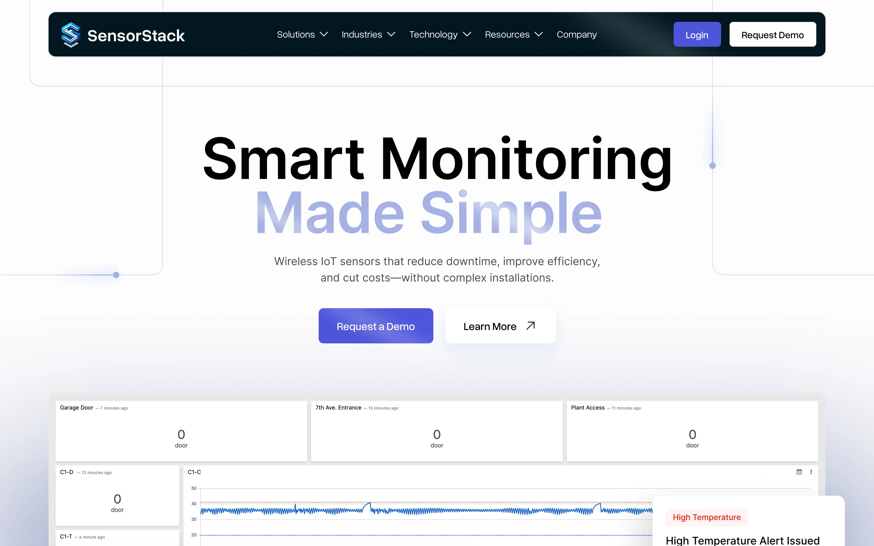
I designed the website for a company that makes wireless sensors.

- Role
- Web design
- Platform
- Website, responsive
- Year
- 2025
Case study 03
SensorStack
A website that explains smart monitoring simply.
I designed the website for a company that makes wireless sensors.

02Listen The question
How do you make sensors feel simple?
The website began with a question: how could a technical product feel simple to its users?
SensorStack sells wireless sensors and a cloud dashboard. Its customers work in many industries. The website had to make sense to each of them.
ScopeWebsite design only. The dashboard is SensorStack’s own.
02 Listen The question
How do you make sensors feel simple?
The website began with a question: how could a technical product feel simple to its users?
SensorStack sells wireless sensors and a cloud dashboard. Its customers work in many industries. The website had to make sense to each of them.
Website design only. The dashboard is SensorStack’s own.
03Brainstorm Shaping the idea
Structure first, then style.
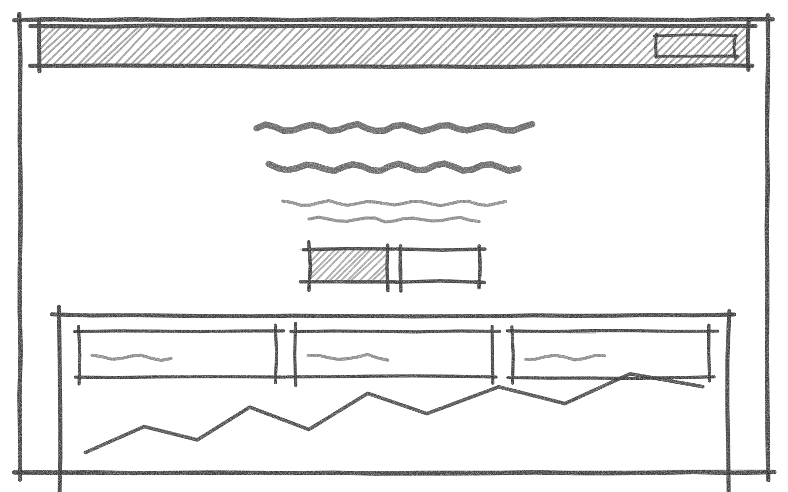
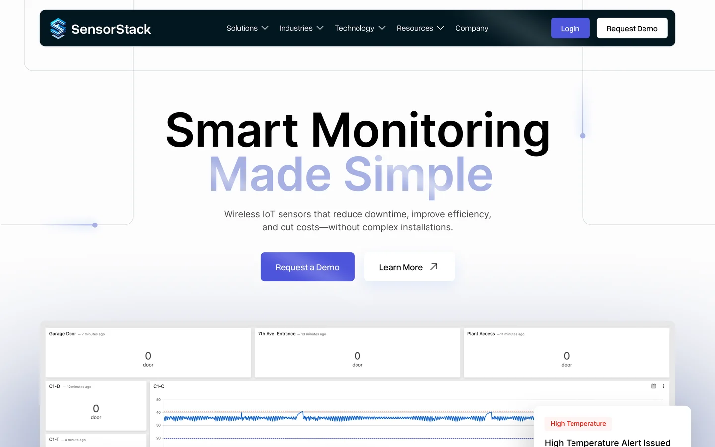
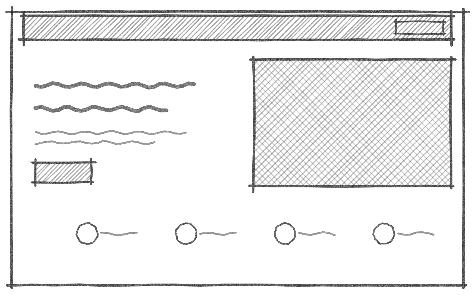
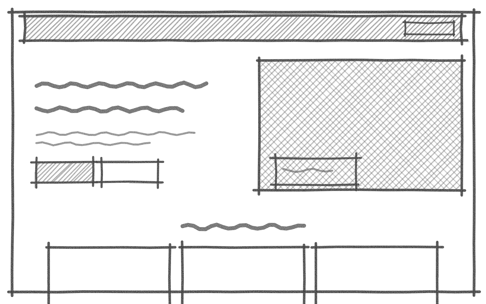
Each page started as a pencil sketch: the homepage, the industry pages, and the technology page. The final design kept that structure.
The first impression
01 / 03


Homepage, 1 of 3
03 Brainstorm
Structure first, then style.
Each page started as a pencil sketch: the homepage, the industry pages, and the technology page. The final design kept that structure.
01Homepage
The first impression
01 / 03
04Decide
One message at the top.
One design decision, written as a record: the question behind it, what I chose, what it cost, and what is still left to test.

Decision record
Homepage
- Question
- What should a visitor understand on the first screen?
- Decision
- I put one plain headline first, with the dashboard right below it.
- Trade-off
- The technical details moved further down the page.
- To test
- Whether visitors still find those details.


04 Decide
One message at the top.
One design decision, written as a record: the question behind it, what I chose, what it cost, and what is still left to test.
Decision record
Homepage
- Question
- What should a visitor understand on the first screen?
- Decision
- I put one plain headline first, with the dashboard right below it.
- Trade-off
- The technical details moved further down the page.
- To test
- Whether visitors still find those details.
The website, in view
5.1 Homepage

5.2 Industries, food and beverage

5.3 Integrations
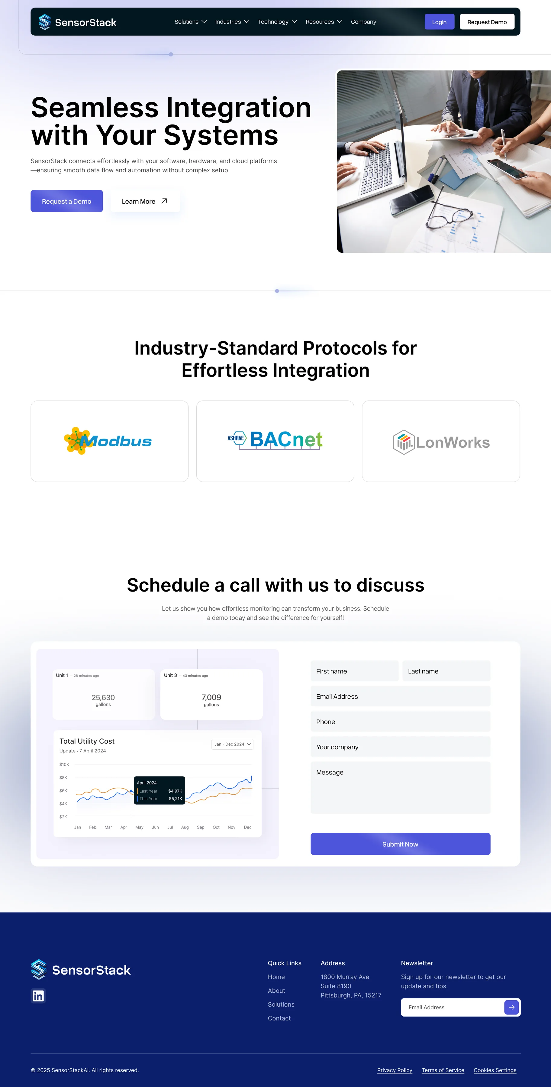
5.1 Homepage
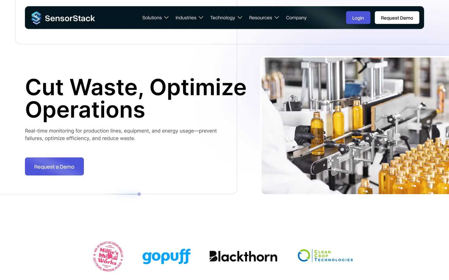
One headline, then the product.
The page opens with a plain headline, two buttons, and the dashboard right below.
Syamil
5.1 Dashboard
The product, up close.
The dashboard continues below the headline, followed by the logos of four customers.
Syamil
5.1 Features
Five features, one grid.
A grid of cards explains the dashboard, each with a small piece of the interface.
Syamil
5.1 Industries
A tab for each industry.
Visitors pick their industry and see a short message written for it.
Syamil
5.1 How it works
Monitoring, step by step.
Three photo cards show the steps: deploy sensors, collect data, monitor in real time.
Syamil
5.1 Customers
A customer’s words.
One customer explains how SensorStack helped keep their product safe.
Syamil
5.1 Request a demo
A clear last step.
The page ends with a short demo form next to a dashboard card.
Syamil
5.2 Food and beverage
A page for one industry.
Each industry page opens with its own problem, in that industry’s words.
Syamil
5.2 Food and beverage
The problem, in numbers.
Stat cards show what spoiled stock and wasted energy cost a business.
Syamil
5.3 Integrations
How it connects.
The technology page explains how the sensors work with existing systems.
Syamil
5.3 Integrations
Standard protocols.
Support for Modbus, BACnet, and LonWorks is shown as a simple row of cards.
Syamil
Homepage01 / 03
5.1 Homepage
5.2 Industries, food and beverage
5.3 Integrations
Homepage, 01 / 03
06Looking back


Many pages, one system.
The site has 12 pages. I designed sections that could be reused across all of them.
If I continued
I would follow how visitors move from an industry page to a demo request, and adjust the pages around that.
06 Looking back
Many pages, one system.
The site has 12 pages. I designed sections that could be reused across all of them.
If I continued
I would follow how visitors move from an industry page to a demo request, and adjust the pages around that.
07A starting point for yours
Could a website like this work for your product?
SensorStack is a live website. If you’re planning a site for a technical product, I’d like to hear about it.
We can talk about what fits, what needs to change, and how it could work for your team and customers.
A first conversation about your idea, your needs, and where we could begin.

07 A starting point for yours
Could a website like this work for your product?
SensorStack is a live website. If you’re planning a site for a technical product, I’d like to hear about it.
We can talk about what fits, what needs to change, and how it could work for your team and customers.
A first conversation about your idea, your needs, and where we could begin.